
Creative Review Gradwatch 2017
I am so grateful that Creative Review spotted my work at the Degree Show this year. They kindly gave me a feature on their website and Instagram page.
If you have the time check it out and have a look at what else they were inspired by.
https://www.creativereview.co.uk/gradwatch-highlights-lcc-design-degree-show/


Holiday Surrealism


A New World
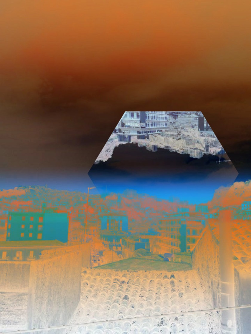
When I began experimenting with colour, I was fascinated with the way the above image came out. It had many links to the Yoko Honda’s nostalgic work especially within the sky. The colours this time to appear more embedded and having a smoother flow. At this point, I am discovering new methods of editing photos everyday which I am very happy.
Of course there was still work to be done and I looked at changing the gradient and focusing on the colour and pattern structure.


These were not planned but more trial and error. Nevertheless, they are inspired by sunsets, so the composition is set similar to a horizon. I have been able to place the colours in a specific spot so it matches the lines within the image.
Back To Photofusion


Inspo by Edwrd Honaker.
Getting inspiration does not necessarily mean getting research from the exact same topic as you. It can be from anything visually or method wise.
I became fascinated with this artist, Edward Honaker because of the way he erased a memory. Exploring his own struggle with depression and anxiety, he has been able to manipulate powerful portraits to move people.

He has shown that when you suffer from this mental illness, your mind it not working properly and it can be struggle with every day life. The way in which he has edited his portraits is dark and removing the face removes his identity.


Colouring Photos
One of the hardest things when editing photos or even film is getting the right colour. This is an element which will emphasise a melancholic and nostalgic mood. I had to do research on colours and the emotions they portray. Colours in particular were pink, red, purple orange and blue.
But I did not just want to use the internet to discover emotions that I already felt. Going back to my initial idea with the shaped colours, they were created by colours I remembered seeing whilst on holiday.

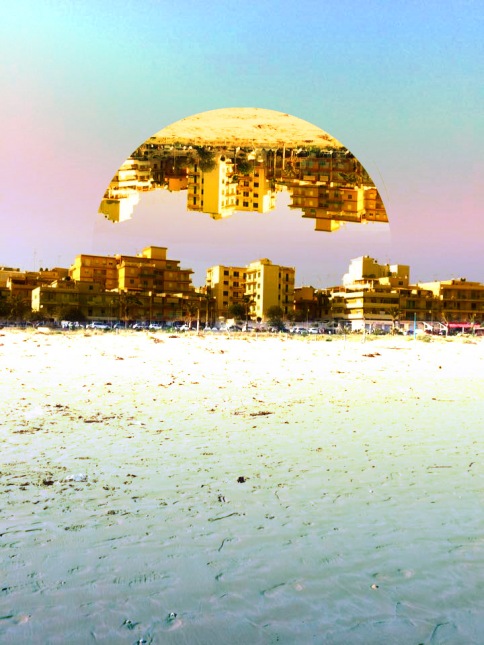
The picture above is what I first started with but was unsure of where to go with it. Everything within this outcome are all what I am currently experimenting and developing. It was good to look back at this because I needed a reminder of what I did not want to completely lose.


As I was saying before, I was also inspired by mother nature and colours that are given off by natural moments such as sunrises or sunsets.

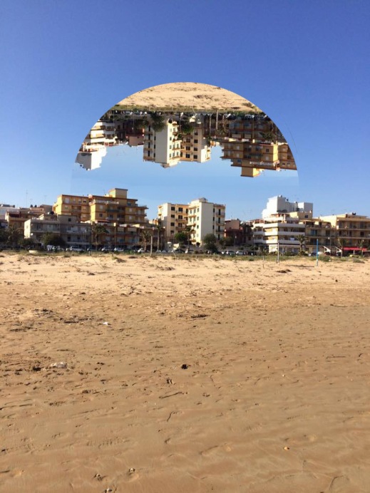
Manipulation Development
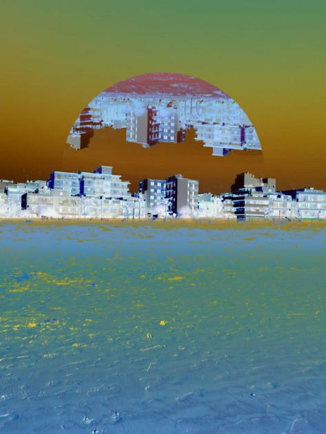
I felt that my images could be more stronger within the manipulation. I took the circular shape I was initially using and made a duplicated reflection of the same image.
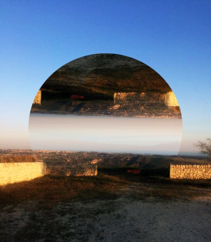
I thought they were more interesting to look at, as well as still being able to see all of the details of the photograph. I liked they idea of seeing the shapes outline. I did create some visuals that did not show this and felt that the reflection seemed slightly off and not connected.


How I am currently working is based on how the photograph is structured. Some looked better with more negative spaces than others and vice versa.

My next plan is to play around with colour and shapes. Since I am focusing on a theme that involves emotions, colour is significant to set a nostalgic mood.
The Photographers’ Gallery
The Photographers’ Gallery is dedicated to photography and has collection from the latest to historical artist.
We visited Roger Mayne’s exhibition that includes his work from the 1950s and 1960s. It involves communities from London and outside the capital. He manages to capture street life as well as range of dynamic angles and abstract forms of urban environments.
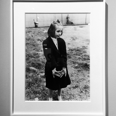
The visit to this gallery made me think more on the idea of why today’s society has an interest in old photos. I have seen many street photography that includes people but it does not give me that same feel as I do when look at vintage material. I believe everyone has a collection of old photographs that have a great meaning to them personally. There may be some that do not. However, in perhaps 50 years they will worth a lot.
This is why in the class of this workshop, we were taught not to think so much when we go out to shoot. Because no matter what you photograph is will hold some sort of memory that is different to something digitally produced. Film is personal because it is something that can be stored in a more physically way.
We also visited another exhibition by Diane Lixenberg. Her images were powerful because they were printed on a large scale and were all shot by film. It amazed me how possible it was to create sharp images in the dark room and not digitally.

Self Initiated Project 2
I will be looking at post-holiday blues, as it something that I have recently felt and that I believe most of go through when returning from a good get away.
The resources I will be using are photographs that I have taken during a trip to Sicily.


The idea was to manipulate the photos in a way that portrays a memory that you do not want to forget but the truth is you will forget some parts or perhaps may never get another chance to visit.


I have continued to experiment with different ways to show my idea including colours within the image and the manipulation.
